The Redhead Restaurant Branding and Identity DesignPosted by Christine Clayton on January 17th, 2020
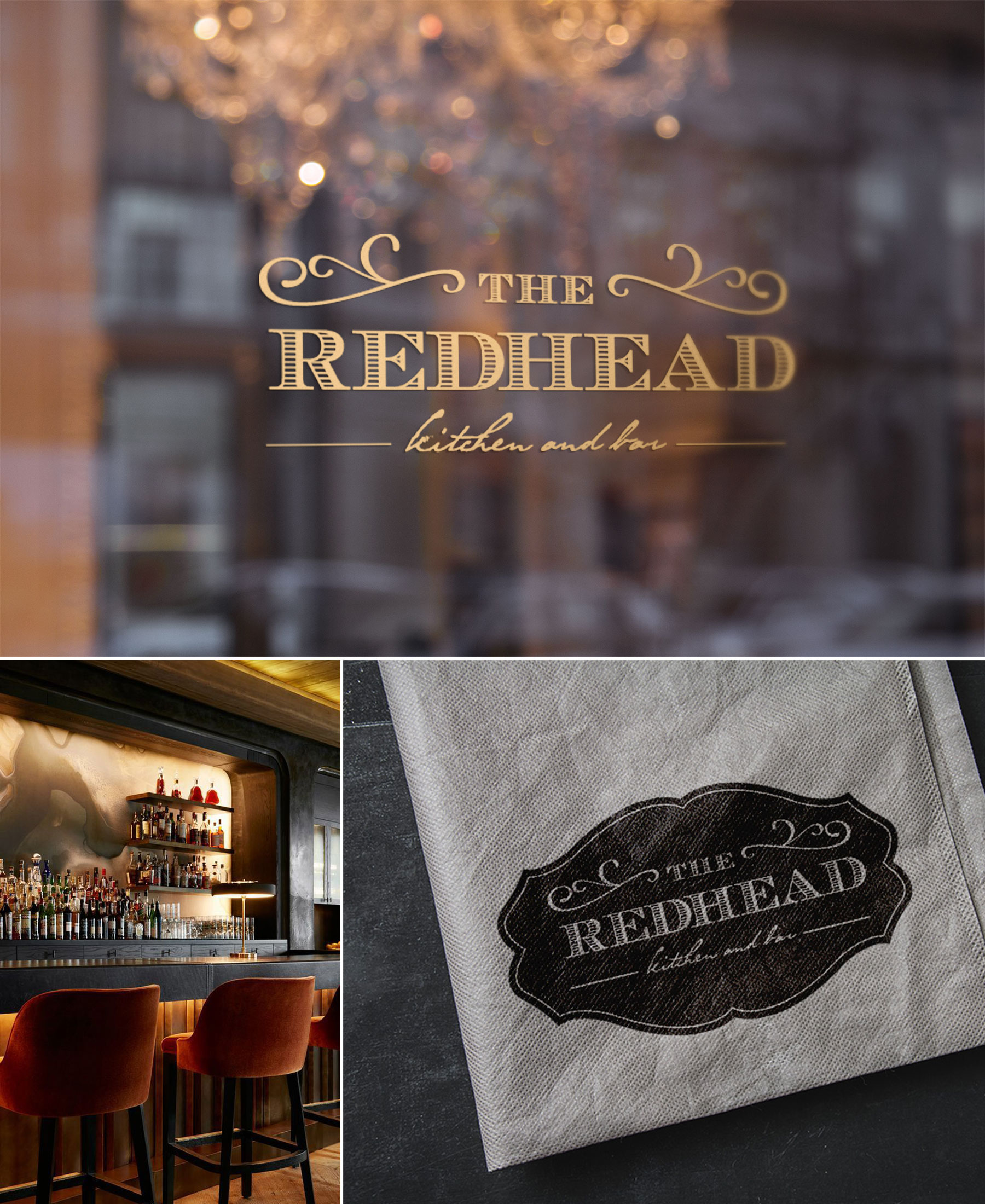
This project was a rebrand of The Redhead, a restaurant in the East Village of New York City that serves a menu with a Southern slant. Since 2006, Chef-Owner Meg Grace filled the menu with seasonal, farmers market finds and Southern staples like buttermilk fried chicken, Low Country shrimp and grits, and collard greens. The rebrand is a subtle nod to the restaurant’s Southern heritage while at the same time referencing the love and care Meg brought to these seasonal ingredients. The branding and logo design are a subtle nod to the restaurant’s Southern heritage and references the love & care Meg brings to the seasonal ingredients. THE PROCESS: In the concept phase of the project, I came across three self portraits (below) which were the work of a photographer, Amelia Fletcher, from Asheville who I would later collaborate with on the images in this piece. As the moodboards and concept gelled, I began to realize how perfect her style was for the brand aesthetic that was beginning to form. And so I in New York, she in Asheville and having never met, communicated every detail through moodboards and a very detailed creative brief which would inform the style, props, and lighting. Her resulting images which were used in the website and various marketing pieces can be seen below. Like it? Share it! |