Responsive or Adaptive Web Design? Which One Should You Go ForPosted by Morris Edwards on December 16th, 2017
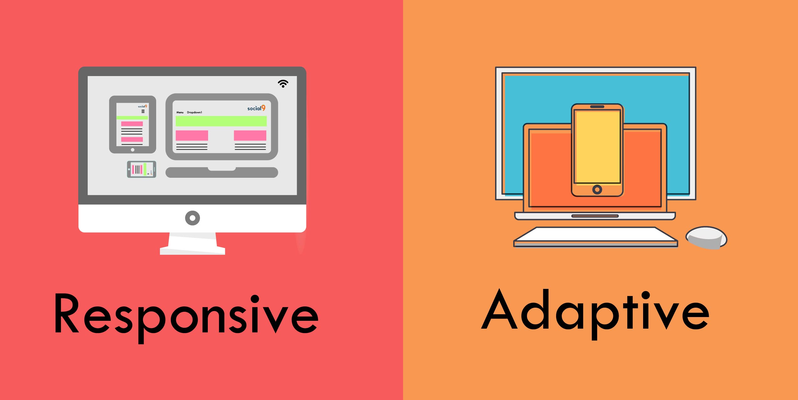
Mobile devices have literally overtaken the desktop computers and have become the preferred choice of the online users. As a business owner, you cannot ignore the mobile devices, the smartphones, and tablet computers and want that your website loads seamlessly on all of them. There are two broad aspects of web designing that are implemented for building websites for mobile use. These are namely responsive and adaptive. Firstly, let’s have a brief about both the web design. Adaptive Web Design Adaptive web design has quite a few distinct layouts for the different screen sizes. Every layout that is used will depend on the screen size. The specific layout for the different mobile devices will be built in advance. Until a user visits the website on a particular device the layouts will be on standby. The type of devices that are used will be detected by the website and a pre-set layout will be delivered to the device. Responsive Web Design A responsive web design will provide the best possible viewing experience of a website. It doesn’t matter what size of the device you are using for navigating it. As a user, you will be offered with an awesome navigation experience that will make it quite easy for you to go through all that has been published on a website irrespective of the device you are using. The reason for the optimum viewing experience is due to the use of fluid grids. So Which One Should You Go For? In order to differentiate between the two web designs, we are going to have a look at a few of the factors. So, let's begin. Development Process Out of the two web designs, Responsive is the one that will be tedious to build. The developer will have to pay extra attention to the organization and the CSS of a website. This is necessary as it will ensure that the website will load seamlessly on all the different devices irrespective of their size. Developing the entire layout of a website is challenging when compared with building a single layout that will work on the different screen sizes. Flexibility This is one factor where responsive web design comes out as trumps. Adaptive web design might be easier to build but the downside is that it will not be able to load in the desired manner on a wide range of devices. However, this is not the case with the responsive design. You will have a guarantee that no matter what size of the device you are using the website will load in the best possible manner. As nowadays there is not a standard fixed size of devices that launch, a responsive web design will ensure that your website is able to provide your users with the best possible way. Load Speed The load speeds of a website have become a pivotal concern as it is one of the major factors that make a user stay on a website or start looking for other faster options. As an adaptive web design has to load all the possible layouts the load speed of a website will be slow when compared with a responsive web design where only a single layout has to load. Summing Up By having a look at the above factors it is clear that responsive web design is the best option for your website. Along with offering a seamless navigation experience on the different mobile devices your website is going to load at faster speeds. So, I would like to conclude that responsive web design should be your choice over the adaptive one. Like it? Share it! More by this author |